Pages

Monday, December 17, 2007

A Drawing A Day 12.17.07

I'm not going to lie. Some days are worse than others. Some days I really don't feel like drawing and you can tell. ON these days I don't think I want to write too much, either.

Cupcake from Hannaford's. 45 minutes. Didn't even finish the icing. This cupcake isn't that attractive. Frosting is very crisco-y. Even still, I was tempted to eat it. I didn't. When I went in the kitchen, the Christmas cookies Arianna and I made were more appealing.

Cupcake. 15 minutes. Didn't even waste a half an hour on this one. Tried another experiment of using one of dad's old psych textbook pages. Chose this one because it talks about human error and since the first drawing of the day was full of human error, I thought it would be appropriate. (Side note: I have enjoyed using these books in my art. See this entry for another example.) Same cupcake from Hannaford's. Hate to waste food, but this one is going in the trash. Just like the drawing should.

I said before though, I am not only posting good drawings in these posts, so I guess today proved it with some really not-so-good ones.

I also have to figure out this scanning thing. It seems off. On one hand, things are looking better than they actually do, sort of, and on another, they really aren't accurate.

Friday, December 14, 2007

A Drawing A Day 12.14.07

Hey there cupcake! As I said in the last post, I really wanted to draw cupcakes. I wanted to eat them so therefore, according to my new plan, I wanted to draw them. Last night Kevin and I walked to downtown Waltham in the snow, had a lovely dinner, and stoped to buy carrots and cupcakes on the way back. The cupcakes were pretty sad looking, and not worth carrying the one mile trip back up the hill in the snow. So, long story short, this morning I made them. I made my models. From scratch. Not sure why I made them from scratch, but I did. Took longer than I hoped. And of course I tested. The batter. The frosting. The cooked cakes. I didn't eat either of the two I am drawing though. And the remaining 18 (it only made 21) are boxed up for the birthday of lovely Rachel tonight.

When they were done and frosted, I drew. I clearly had a better time with the wrapper than the cupcake, which brings me to wonder, was it worth all the effort of baking?

So the f
irst one is my classic 6x6 inch drawing. There was a shadow, but it took away too much from the cupcake. I erased it, but it was there pretty well, so it's still there. Though I am liking how the folds of the wrapper turned out, I do feel like the right is a little awkwardly shaded, and in the next drawing I do, I will aim to even that out. Additionally, I need to work on the frosting. Clearly its underdone, but I just got frustrated with it, and since my 30 minute timer had gone off, I allowed myself not to be consumed by the drawing/frustration. One thing I should have not done is put sprinkles on top. I mean, its been a while since I have been really drawing. I think that frosting itself with out all these glassy confettis all over it is enough of a challenge.

For the second one, sized at 5x5 inches, I did something different, in which I like the concept, but it didn't turn out exactly as I planned. I drew the cupcake on a pink and green paper to represent frosting and wrapper. I kind of like it, but next time I think i am going to have it approximate the line of the cupcake-wrapper break a little more accurately, or at least try at all! This cupcake had no sprinkles (well it did, but I brushed them off and refrosted, which in turn left for rougher frosting, as it was beginning to dry.) Again, I like the wrapper more than the frosting -- while the frosting in the above drawing was underdone, this frosting seems to be overdone.

Thursday, December 13, 2007

A Drawing A Day 12.13.07

Ok, first off, I know this seems more like a drawing a month. I know, I know. I need to put a little more pressure on. Second, I'm having a hard time figuring out subject matter. That part is killing me.

So I had this great idea to draw what I felt like eating instead of actually eating it (I have a major sweet tooth I am trying not to over indulge.) Here are the couple of problems with that: 1. I like to draw from life. To draw from life means I have to have it in the house. To have it in the house means, well, um, not helping the indulgence thing...I mean, today I really wanted to draw cupcakes (lately I have been inspired -- and hungry -- by the creative drawings of Cakespy). To draw cupcakes though meant I would either have to go buy cupcakes or make cupcakes, but either way, there would be a lot of cupcakes in the house...probably not the best idea. 2. I love ice cream most of all. Even though these drawings are quick, I don't think the ice cream would hold shape long enough for me to draw. I haven't figured it out yet, but I do think I will come back to that sweets thing. Especially since Arianna and I are making Christmas cookies soon. Perhaps I should keep a couple...

Long story short, I drew an onion. Well, mostly the plant growing out of the onion. Needless to day, I wasn't too tempted to eat the onion. Besides the fact that the onion was taking on a new life of it's own, I have become less and less fond of onions. Maybe its because I hate to chop them -- they make me cry so hard.

This was a pleasant 40 minute drawing. It's snowing out and as I drew today, I faced the window and watched the snow fall silently to the ground. I needed a little bit of accentual light, but partially out of laziness of getting and clipping the clip lamp and partially out of my desire to keep with the natural, I lit a candle. (It's the last time I will draw to a Yankee Candle Country Linen candle -- that smell was too much for me.) The natural light was changing rapidly, so the drawing was a challenge. Highlights and shadows kept changing. I don't love the drawing, but I did it. Perhaps in a week or so I will revisit the onion drawing. I imagine it will be quite a change.

Tuesday, November 27, 2007

A Design A Day? A Design for Day.

I have been a bit busy designing lately, and I thought I would post some of my designs, just so you know I haven't been slacking! Left is a business card/logo I designed for daytauro Art Glass — the website can be found here and the online shop can be found here. The work is beautiful so take a moment to visit and enjoy!

More to come soon!

Tuesday, November 20, 2007

A Drawing A Day? 11.14.07...

So I said some of these drawings would be not as frequent and hopefully some of these would last over some days. Here is one of them. I think I left the original drawing at the studio, and I will need to get that and scan it in at some point. This one, Pair and Lemon (© 2007, silkscreen on paper, 6x6 inches), is currently undergoing some analysis. It wasn't supposed to stop here but I am thinking I like it. However, I have a number of copies of this, so it is always worth playing with. I really like the depth and the layering of color of this print. I love the simplicity and the boldness.

The tan background was created by printing the off white twice over the brown. I like the effect, but it was originally
supposed to be less opaque. The reason I printed the white twice was that I am really having a technical problem with snap-back, and my screen keeps kissing the he paper when lifting and leaving these rings. I am really quite frustrated with that part of it, and I have been doing a lot of research and book buying and group joining to get help, because the one answer I got twice is just causing more problems.

The original piece, and the way I might go deeper into other copies of this, was supposed to have a shadow under the fruit and an outline, done in woodcut but also reminiscent of Roy Litschenstein's linear treatment (as in this painting). I am not even sure how the woodcut will take, as I don't have the most advanced woodcut printing set up and my woodcut skills are a little rusty. Speaking of rusty, I might even need to sharpen my tools and I don't even remember how! I will post the results when they happen though.

Tuesday, November 13, 2007

A Drawing A Day 11.13.07

So, many moons ago, I decided to do a drawing a day on 6x6 inch paper and post about it. That lasted about 6 days.

I found the 6x6 pad of paper today. I want to retry this. But my rules won't be so strict. I am going to try to do one a day, generally between 30 minutes to one hour. I like this amount of time because it forces me to focus, but if I am getting frustrated, I know there is an end in sight. Of course, I won't just abandon the drawing if I am loving it. Maybe I'll spend five hours on it that day. Maybe I'll scan it after an hour and come back to it in a week. I don't know. I am not going to lose sleep over it if I don't do one a day though. It doesn't have to be a drawing in the typical sense of the word. I do want to keep it to 6x6. I am not going to post all of them, but at the same time, I am not going to post only the ones I like.

On that note, to start off, I don't like this one in the physical sense. Its too dark, not enough contrast. But I like it in the sense that it is the old college try and I like it in the sense that I am a bit rusty from not having done this in so long...And I am going to try again, and that counts...

I decided to draw one of my jewelry tools (yeah, I make simple jewelry on the side. You can see some of it -- where else? -- my etsy store.) Anyway, I thought this would be a good thing to draw since the jewelry is also something I have rediscovered recently. Anyway, I drew this for 30 minutes while listening to Jess Klein. I thought her song Darkroom would motivate me with its, well, you know, photography/visual arts theme. It helped. Music usually does.

That's it for now.

Thursday, November 1, 2007

December Sale

In Checking In," I mentioned the December Sale at the Museum School. I am selling some older work, because I have just been too busy to produce new work in time. It's good though, that the older work is getting some press time too, I guess, and it was nice to find some of these pieces because I had practically forgotten about them.

The one with the grass and the moth is called It's Not Pretty to Me (©2006). It's mixed media -- the grass and sky panels were screenprinted, the path of the postage stamp moth is actually sewn black thread. This one was a lot of fun because it really evolved out of the screenprinted panels, which began as just an exploration of alternate screenprinting methods.

I am also going to sell Bird on Green, which I LOVE for its simplicity. It evolved out of a teeny sketch of a bird I did that I just fell in love with and realized I needed to take it a step further and out of the hidden pages of my sketchbook. I like that about sketchbooks. You can draw and create lots of junk in them, but once in a while there is a little hidden gem that you can just pull right out and integrate into something else.

The last little pieces I am going to put in are those laundry prints I have been meaning to post. I have scanned some in, but I am not quite sure these are going to be the ones I am going to submit. They are all a little varied and that is what I love about them. I love the new dimension they have to the OLD laundry prints (Fresh I and Fresh II), I am thinking maybe I will take the old laundry prints in their size and variety of laundry and integrate the cut paper and color. The irony is, Fresh I was supposed to have lots of color, but then when I saw the line drawing, I liked that. Hmmm, it all comes around, I guess.


Wednesday, October 31, 2007

Musings on Marilyn, for Grandpa

So I keep coming back to this image but not knowing where to go with it. Something about it is flat, missing. Maybe it's just too pastel. Maybe the bus just needs to be bolder, stronger...it gets lost in the background. Perhaps I will come back to this over the course of my blogging, visit different versions.

I am not sure whether to turn it into a screenprint at this point. It doesn't seem settled to the point of committing it to ink, but at the same time, maybe that's just what it needs, some ink, then some working into it, or over it.

I am very tired and I should get to bed -- maybe the bus will look brighter in the morning. Probably not.

Checking In

Just checking in. I know I have been MIA with the wedding and all, but I am back and ready to go. I have been a little slammed with freelance work (some stuff I will hopefully be able to show you once the clients approve, etc.) as well as getting some work ready for the Museum School's December Sale. More on that soon.

Monday, October 15, 2007

Jamaica Plain Open Studios, Part Deux

It has been crazy busy. Will catch up with more when I get back from Greece, but for now, here is a great shot taken at Jamaica Plain Open Studios this year.

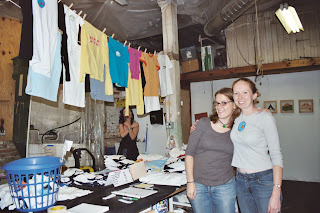
This is a nice view of the space we work in and of the teeshirts we make. Sad to not participate this year, but will be ready and rearin' to go next year.

Wednesday, September 26, 2007

Jamaica Plain Open Studios

So I shouldn't be blogging at work, but I wanted to post this information about open studios…

Due to some big changes in my life (getting married in two and a half weeks, for one…) it just wasn't feasible to participate fully this year, but Sarah will be opening up the space…stop by and visit her, and check out her great work…see below, she says it best…

Thanks to Sarah for offering to show and sell some of my work as well….

Next year I will be back and better than ever! (Which reminds me I need to share some other big career change news…) More to come on that...

---------------------------------------------------------------------------------------------------------------------------

It's that time of year again! Jamaica Plain Open Studios are happening this weekend! Please come and enjoy all the wonderful artists and stop by the studio workshop of Sarah and Bethany, formerly known as INK in the SINK.

This year only Sarah will be available at the studio and showing her works on paper, along with a selection of Bethany's prints and sculptural work. As always there will be a selection of our fantastic screen printed apparel! Enjoy a bit of wine, and cheese, as you peruse the work. There are several other artists in our building that will be showing as well.

Here's the info:


Who: Sarah Carroll and work by Bethany Schlegel

What: JP Open Studios! Great Art!
When: September 29th – 30th
11 am – 6 pm

Where: Parking lot entrance
128 Brookside Avenue.
Jamaica Plain, MA

Find Us:

Public Transportation:
We are conveniently located one block from the Green Street MBTA stop on the Orange Line.

From the T stop, exit to Green Street heading southeast. Turn left (northeast) onto Brookside Ave., past the main entrance at 128 Brookside. Take a right around the building into the parking lot. Our studio is located at the end of the lot. See attached map.


Driving

If you are driving please note the lot adjacent to our building will most probably be full. But there should be plenty of street parking.

The day of the event, there will be print map books available at select locations. I urge you to plan on visiting a number of the studios if you have time – JP has a quite a prolific artist community.


You can download the map book in its entirety at: http://www.jpopenstudios.com/


For more info on JP Open Studios visit: http://www.jpopenstudios.com/


For info on Sarah's work: inkedpixel.etsy.com


For info on Bethany's work: buzzbuzzbee.etsy.com


Please note: All online sales are suspended this weekend as the inventory will be at Open Studios. After this weekend, you can purchase apparel and selected prints on our websites.


We are excited to invite you into our space.


Looking forward to seeing you there!


Sarah


Sunday, September 9, 2007

Changes to Psychology

So, I have been dealing with a lot of anxieties about my future, so I decided today to tear up some books. Man, it felt good. Normally I am not one for tearing up the written word (I find books to be so precious) but my dad gave me a bunch of old, outdated psychology books he was getting rid of.

The books have this wonderful musty smell and yellowing pages (gosh, I am making Dad seem so old -- he's not -- really, its just that
textbooks don't seem to have a very archival quality to them -- probably because it isn't worth the money when new editions are pushing old copies out-of-date faster than one pay the hundred plus dollars it costs to buy text books these days. I could go on and on about the textbook business, as I was once in publishing, but I'll spare the details. That said, that might be another underlying reason I enjoyed so thoroughly tearing apart the old textbook.

So, anyway, this book alteration came out of an old project I did years ago that I always hoped to re-explore again. I don't think I want to talk too much about it
-- Hopefully, despite my poor photo skills, the project can somewhat speak for itself. 3D is kind of hard to photograph as an amateur, but I won't let that stop me from creating in 3D -- I really like 3D, I think it is in the blood -- my late grandmother was a talented sculptor and my dad is creating some beautiful sculpture himself when not being Santa Claus.

I am not sure that this project is done, I think it needs something else, but I will sit on it and come back to it when I am ready. I am wondering if there is a way to integrate screen printing without being too loud, without taking away from the elegance of the piece.

Right now I am most enamored with the small window that opens to the inner most scroll, revealing the intricacies of the twine that binds it interacting with the text on the page. I really tried to get a good shot of this, but I had to use a flash since my tripod is still at the studio, and the flash blew out the detail. When I bring the tripod back, I will try to get a better picture. (see right)

My last issue with this piece is how it should be presented. I designed it verically, so that it would be like an open book on the shelf, but I am really loving it lying down, tent-like. I am not exactly sure which works better.

For more images and different angles of this piece, please feel free to check out the photo collection here. (Blogger was giving me a bit of trouble with inserting photos so I limited the number I am showing here)

*Peggy, this post is for you. Thank you, and I will reply soon*

Sunday, September 2, 2007

Red Light, Green Light. Is it a go?

I have been doing a lot of cleaning and coming across some art. I am not sure what to do with it, since it is printmaking, I have multiple copies and I can't hang all these multiples of one image in the house. (Nevermind the fact that Kevin and I are absolutely horrible at hanging stuff up!) I am debating whether to sell it on etsy. A lot of people sell multiples of their work by reproducing it in archival prints, and sell them infinitely. I don't want to do that, because I think a huge part of the beauty is in the handpulled silkscreen, but in that case, I am limited by quantity and can't charge the same low prices that these people sell their work for.

Well, at least I can post one of the images in question,
Red Light, Green Light, © 2005 (left). This is not the greatest picture. When I start making my art full time, I need to look into having my art shot professionally.

Red Light, Green Lightis the second -- and last, to date! (hopefully with more to come) -- of a series of produce images reflecting the experiences of growing up girl. This was titled after the popular childhood game, bringing up memories of carefree yard games in which both girls and boys participated.

The first in this series is Odd Girl Out, © 2005 (below right). This title was appropriated from the fabulous book Odd Girl Out: The Hidden Culture of Aggression in Girls by Ra
chel Simmons. This book, while examining the cattiness and aggression in girls, also normalized the anxieties I experienced starting in late elementary school. While examining this as a common problem in growing up female, Simmons does not condone it, but instead introduces it as a common problem. These teen and preteen relationships fascinate me, and I hope to explore and reflect on this more in future art. In the meantime, check out one of my all time favorite movies, Mean Girls, which is another insightful reflection on the "hidden culture of aggression in girls."

Quite honestly, I wasn't thinking about all of this when I created Odd Girl Out, but when I finished it and looked at the orange all alone in the corner, that's exactly what it reminded me of -- the sad, lonely, painful time when you are left out by friends. Looking at it totally hit a nerve, reminding me of a time in my life that I wouldn't want to go back to, but at the same time helped me grow up and learn to really find those genuine women friends that are a huge part of my life today.

*On a very cool side note, I gave this as a wedding gift to a friend (for purely aesthetic reasons, not because she ever made me feel this way!) and she told me "Did you know that Chinese tradition is to give and have oranges on display because the Chinese word for orange sounds like the word for wealth? So, growing up, people always gave you oranges for good luck!" I think that is the coolest thing. Thanks for telling me that, Stace, mom of lovely Ivy.


Friday, August 10, 2007

Another Old Video Part II

Have gotten a few comments on the speed of "Another Old Video." That was the project as is. I suppose I could try to slow it, but I am not really invested in the project. Its nothing more than a fast slide show. I mostly put up these short films in order not to lose them forever -- more so not to lose "Ant" but "Another Old Video" was on that tape so I decided to post it as well -- and maybe to inspire me to to an animation.

Sunday, August 5, 2007

Another old video

All this has been in a box for nine years. Even though it is just my learning the tools, I think it is time it saw the light of day. It also inspires me to make animations, maybe.

Ant

I just found this old video from art school. Kevin helped me pull it off a video tape and onto my computer. We are still learning how to do this, so it isn't very good quality.


So uncreative

Man, I have been so uncreative. I need to remedy that. Looked at a new studio in Waltham today. I think one of my problems is that the commute to JP is just far enough it makes getting there difficult.

Speaking of JP, be sure to check out Sarah and Dan (are you open studioing, Dan?) at Jamaica Plain Open Studios at the end of September. This is the first time in a couple of years I won't be doing JPOS, and it makes me kind of sad. But I have a busy couple months ahead of me and I need to be realistic.

Sunday, July 15, 2007

More laundry to do

It's been a while since I posted here. Yep, means I haven't been too creative lately. That's bummer. But the good news is I did finish up the last of the laundry prints, in all the pretty colors and had a super lot of fun patterning some of the clothes by buying some super cool Japanese silkscreened paper at the Paper Source. I am going to trim some for the next 20 minutes and then I am off to bed. I think I will try to post a bunch of the variations in the next couple of days...

Added feature? There was LOTS of leftover paper, so I cut some off the sheet to make some origami earrings, which I sell at Magpie in Davis Square.

Thursday, July 5, 2007

Hopped off to Hopper.

Took a little break from work today (it was a slow day) and went to the MFA with Mary and Marty ("hi, new friend!") to see a little Edward Hopper. I was pretty inspired by our guy Ed! My favorite Hopper painting, Rooms by the Sea, wasn't there, but he had some good stuff! Wanna know the best part? Hopper worked as a commercial artist for years -- he didn't really get recognition for his art until he was in his forties. I still have time!

I sold a copy of the Roentgenium from my Etsy Shop! Yay!

Monday, July 2, 2007

Fresh II

Looking for something else, I found Fresh II, done in 2006. This is the same line drawing as used in My Mother Used to Cut My Paper Dolls.

Fresh I

Promised I'd post one of the original laundry prints. Here it is. There is another one, but I'll have to find that later. This one is called Fresh I, and I think it was done in 2005.

Sunday, July 1, 2007

Hope Cemetery

I should probably add a little about some other art I saw today -- totally inspirational and made me want to take another stone carving class.

My father told Kevin and I about the Hope Cemetery in Barre, Vermont, and Kev and I detoured a little on our way back from Concord, Vermont to go see it.

Kev took some pictures that I will link to when he posts, but until then here are some of the highlights.

There are just some stunning pieces of art here. My dad tells me that the quarry workers of Barre used to spend their lunch hours carving their own gravestones -- pretty morbid, if you ask me! However, these people left quite an amazing legacy -- a sculpture garden in itself. As much as I hate to think about death and dying, it is quite a piece of art to have left behind. Don't expect me to be carving my gravestone anytime soon though!

Finishing the laundry, adding the elements

So I guess I need to finish (and respond to) that last posting about the laundry...So here goes...
  1. Pricing work in general. This has always been a difficult one for me. I just don't know how to do it. I have always wanted my art to be art for the people (aka, not exorbitantly expensive) but at the same time, I don't want to devalue my thoughts, time, energies, or product. I just never know how to price work and it makes it the hardest part of all.
  2. The original design. This was an alteration of one of my original designs. I am not sure if I have an example of it around. The original was larger, just a line drawing. I am now thinking I like this multicolored, more detailed version better, even though I was sure I liked the outlines better in the past. I think conceptually i like the outlines better, they express the ephemeral nature of man made items in an environment that has been in existence for billions of years. Aesthetically, I like the colors included better.
  3. My work as a reflection on everyday life. I kind of touched on that. I really like to reflect on the fleeting moment of these man made items (cars, laundry, etc) in an ever changing, but relatively stable natural environment. Not sure if I am explaining this right -- that's why my art should speak for itself.
  4. There are more of these yet unfinished and each has the possibility of being a bit different. I had to get a few done for a submission, but there are numbers more that I am going to alter and each should be a bit different from the rest. I like about screenprinting that you can reproduce multiples, but I also love the ability to change little elements in my work as well.
  5. Size. The original was designed as 4x6 with some bleed -- I liked the bleed area a lot so I have been finagling the trimming a bit, and I think it is 4 5/16 x 5 1/2
  6. Should I sell this on Etsy? Oh this has been a question I have been struggling with. I feel like so much stuff just gets lost on etsy, and I am not even sure if I should post it there, since I don't even know what to charge.
  7. The first two are in the mail to the Museum School. More on that later. Actually, they are on the way to the Rhys Gallery in Boston, for the Proof of Purchase show. Each alumni artist can submit up to two 4x6 pieces...I meant to do this last year but I forgot to mail the envelope. I sent them anyway, so we will see if they use them this year too. But basically, on August 29-30 from 11-6pm (?) all this art work will be showing at the gallery, and once you buy the piece (each piece is $50) you then can find out if you bought the work of a well known artist or an aspiring artist. Promises to be a cool event. I am going to try and attend myself if I can get out of work that day on time.
Whew. That's it on that.

So my other piece I just finished was for AzureGrackle's super cool Periodic Table Printmaking Project. This was a neat project and promises to have a great finished product. Each piece was 6x6 inches, so must have quite an amazing result when all laid out. I think she is going to attempt to make a book, but I think she should also think about showing them -- maybe curating a science related show with this collection as the center piece.

I was assigned Roentgenium, element 111, since I joined too late to choose, and I had to take what was left -- no wonder it was left -- it was a tough one! I chose to respond to the fact that it was in the same column (shoot, I forget my chemistry) as gold, silver and copper so it probably has some of the same properties. I also thought it interesting that it was only observed three times before it was added to the periodic table (hence, the table)...Finally, I decided to graphically include that it is radioactive.

It was tough and I am not really sure how I feel about it, but it is what it is...


Friday, June 29, 2007

Laundry

I just bought new laundry hampers, so I thought this would be a great time to post one of my newest pieces. Even more perfect, as I rush to get this into the blog before Kev and I go to Vermont for the weekend, the washing machine downstairs beeps away letting me know the laundry is done.

This piece is a mix of ink and collage, entitled
My Mother Used to Cut My Paper Dolls. (The shorts on the far right are collage). I think I like this piece much better than the original piece from which this was expanded upon.

You know what? I have so much more to write about this, but Kev and I need to get to Vermont, so I will leave myself with a list and I will finish when I come back on Sunday.

I finished this particular piece on Thursday night.

Darn. Note to self. Numbering doesn't work so well next to images. So here is my list:

• Pricing work in general
• The original design
• My work as a reflection on everyday life
• There are more of these yet unfinished and each has the possibility of being a bit different
• Size
• Should I sell this on Etsy?
• The first two are in the mail to the Museum School. More on that later.

To Concord, Vermont we go!

Thursday, June 28, 2007

Day One

So I have decided to start an art blog. I feel like maybe if I can get my art online, I will feel like I am doing something. I am not much of a writer, so don't plan on coming here to read too much, but come here to look at stuff I make (and maybe sometimes stuff that inspires me). With that in mind, I don't create something new each day or even each week, so I don't know how often it will be updated. So, add it to a reader and you'll be kept up-to-date.

Until I scan some stuff, you can see a couple of things about me:
  1. Here is my web site. It is badly in need of an update. It's only some of my old design work. Some day I swear to put more of my best artwork up there too, but since I don't like web designing too much, I haven't been too inspired. A couple of years ago, my great need for a new website inspired this one.
  2. I also sell stuff on etsy under buzzbuzzbee. (Thanks for introducing me to Etsy, Martha!) Here's some stuff from my shop below:

Etsy
Buy Handmade
buzzbuzzbee


Oh, I guess I can't add another number after this. Oh well. I wish I remembered my HTML. But I don't. Well maybe I will scan those couple of projects I did this week later tonight, if Kevin doesn't put my rowing machine computer back on the rower.


American Highway I, © 2005

American Highway II, © 2006

Goodnight for now.